
Advisor as content
A widget that brings personalized advisor reviews into the Alphanso dashboard - request, wait, read the report - without leaving the surface where the rest of your money lives.
TL;DR
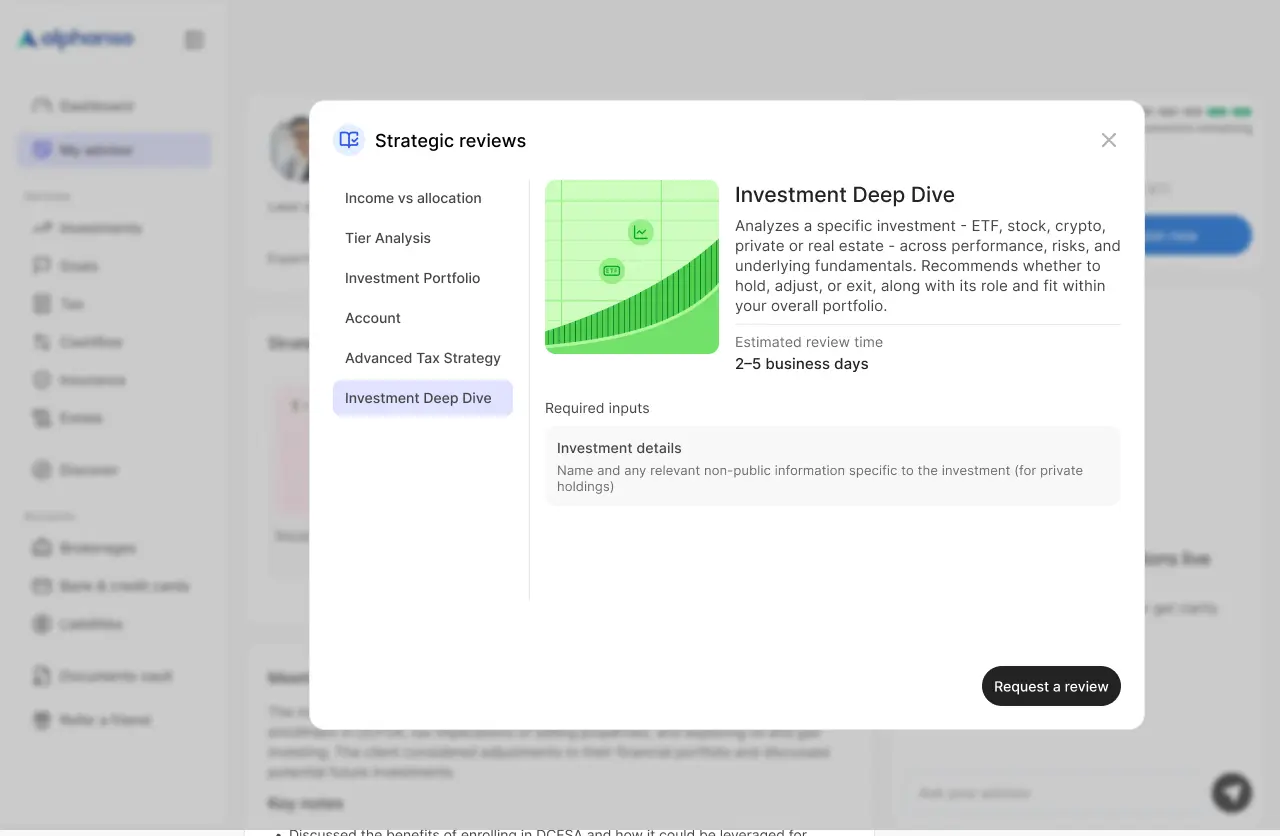
A dashboard widget that surfaces advisor-driven financial reviews as content. Six analysis types, each with custom data visualizations, redesigned across the breakpoints they ship in - all using the same dashboard grammar as charts, accounts, and statements. No separate inbox, no scheduling, no PDF emails.
The gap
Wealthtech products usually pick a side. Self-serve dashboards where you draw your own conclusions, or full advisory where a human tells you what to do. Alphanso bet on hybrid - and that meant designing a way for advisor work to live alongside everything else, not in a parallel space.
The default playbook for adding human advisory to a digital product is a meeting-booking app: schedule a call, show up, get a PDF, never think about it again. Calendar friction up front, attachment-tab friction at the end.
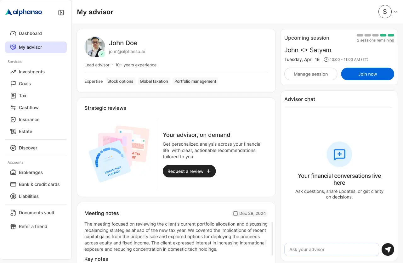
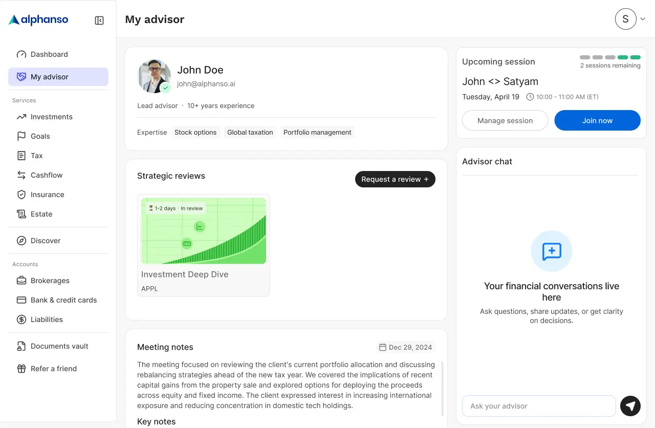
Strategic Reviews bet on something different: the advisor never appears as a person you book. They appear as the source of a report that lands in your dashboard, with the same grammar - chart card, status badge, tap to open - as everything else you already use.
The widget
The widget shell that holds the analyses adapts across three primary breakpoints. Same content, three layouts.
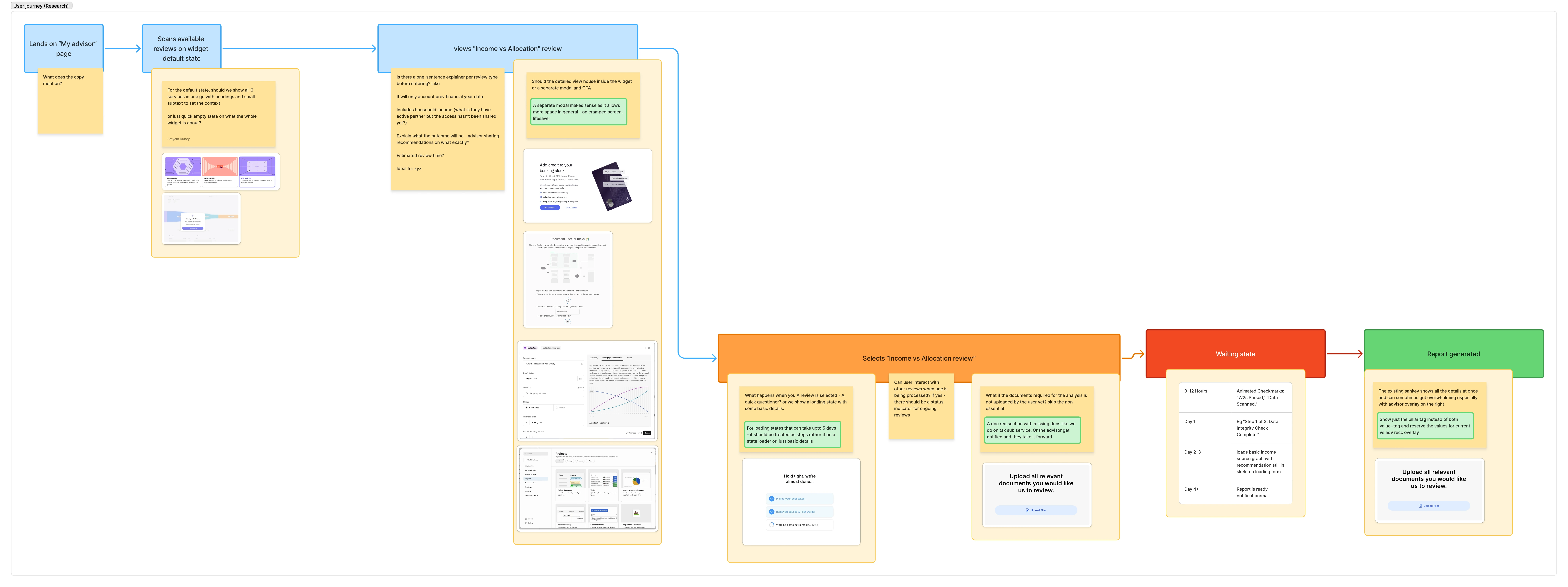
The journey
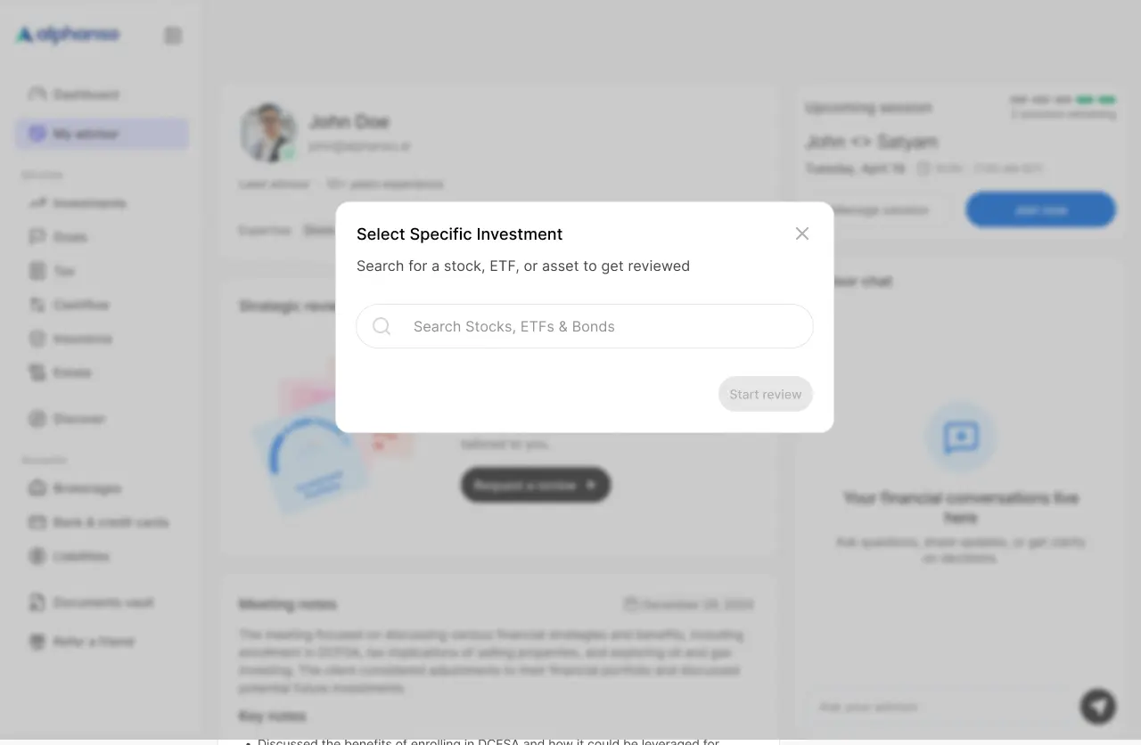
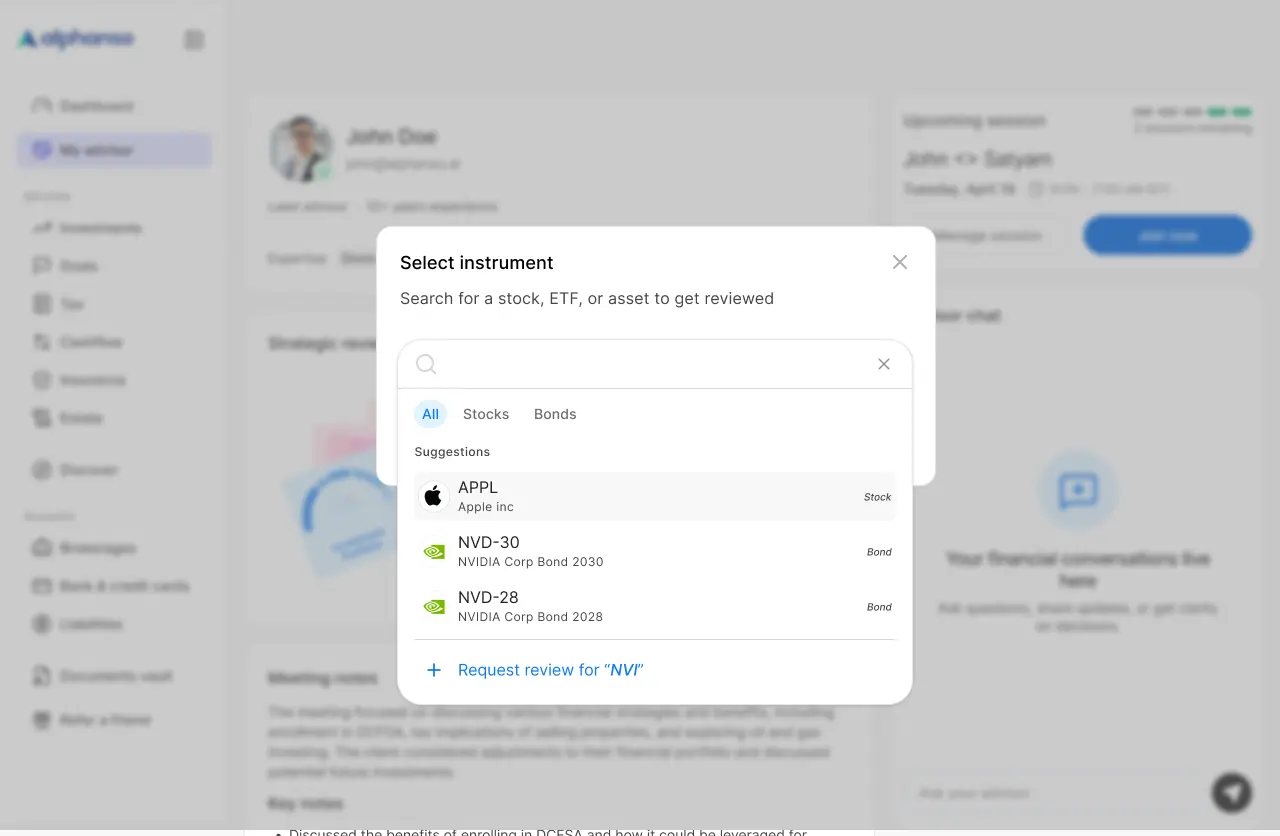
Six steps from a user wanting an analysis to reading the report. Each step traded a default friction point for a quieter one.
The decisions
Two decisions shaped what shipped. Both came from the same constraint: the dashboard's grammar had to absorb advisor work without changing for it.
Modal, not in-widget
The detail view opens in a modal on desktop and a bottom sheet on mobile. The card stays where it was. Two surfaces, two jobs.
Information density adapts; meaning doesn't
Strategic Reviews surfaces six analyses, each a custom data visualization. Every one had to render at multiple sizes without losing the user. The rule: information density adapts to size, but the chart's meaning never does. A funnel stays a funnel; a comparison stays a comparison. Values move into overlays before they get cut.
The flow
Six steps. Click through to see exactly how a review goes from request to in-progress.
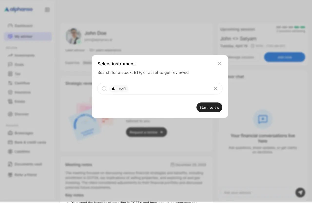
1/6 · Dashboard — Strategic reviews widget, empty state
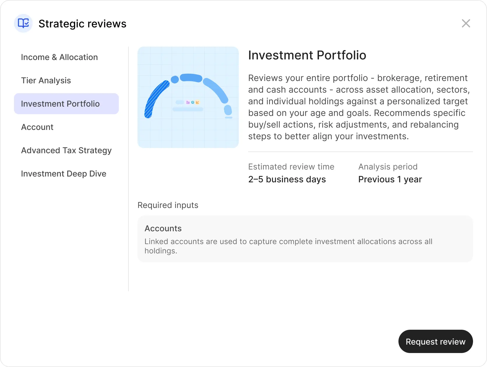
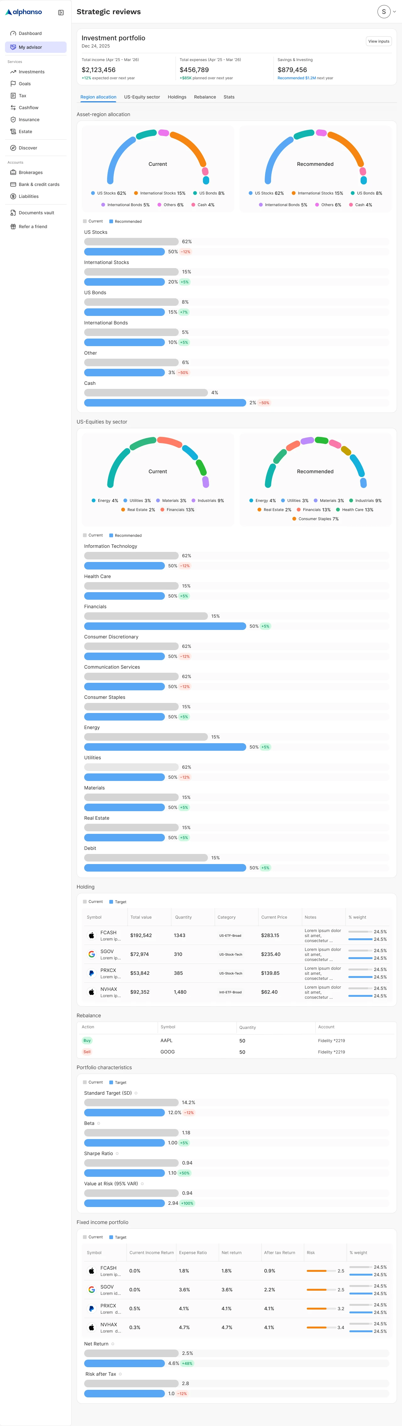
The scope
The work that doesn't fit on a single page. Two of the six analyses - Tier Analysis and Income vs Allocation - shown across the sizes they ship in. Different charts react to breakpoints differently, which is why the size counts aren't identical.
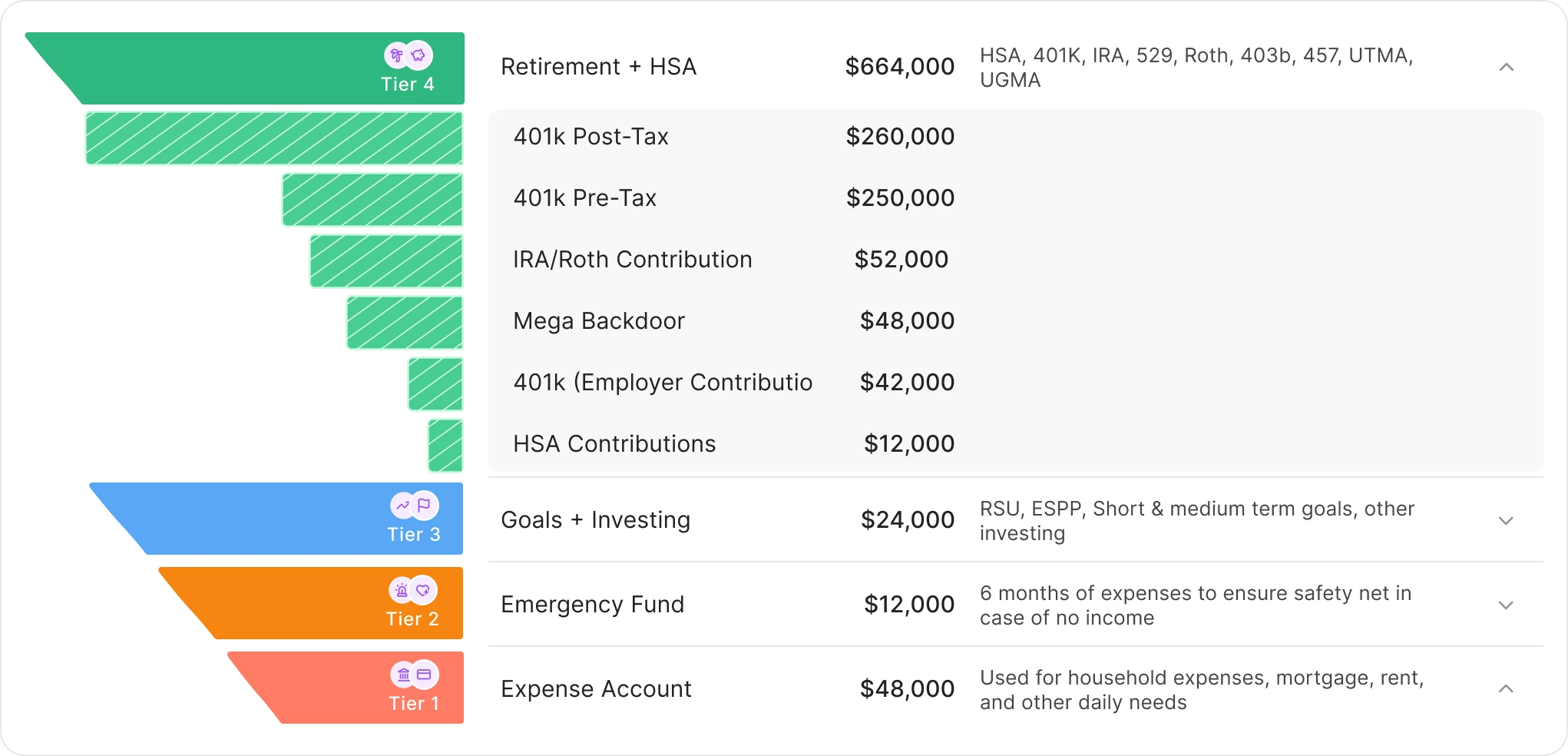
Tier Analysis
A funnel that buckets the portfolio across emergency / short-term / mid-term / retirement, with advisor recommendations overlaid. At Large, every tier shows its dollar value and breakdown inline. At Compact, the chart shrinks but the meaning holds. Tap any tier and the Expanded view opens - the same chart re-shaped as a focused breakdown.
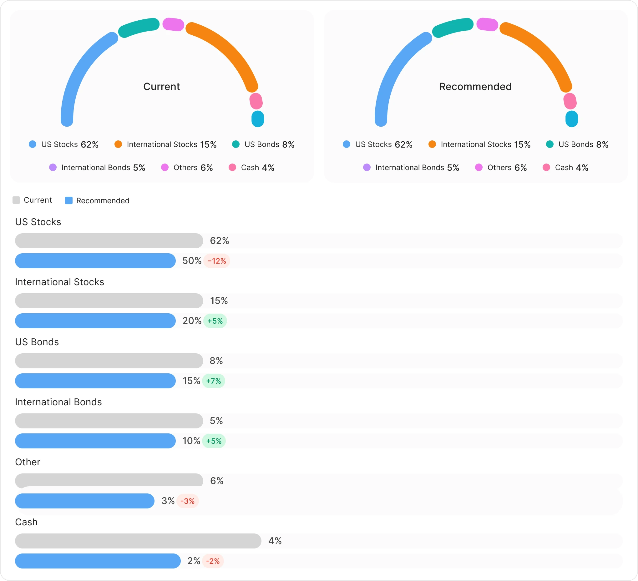
Income vs Allocation
Two donut charts comparing Current to Recommended allocation, with delta bars below. Different charts, same density rule. At Large, both donuts sit side by side. Below the Large breakpoint they collapse into a single donut with a Current / Recommended tab toggle - same comparison, less screen.
The widget
The widget shell that holds the analyses adapts across three primary breakpoints. Same content, three layouts.
Three breakpoints
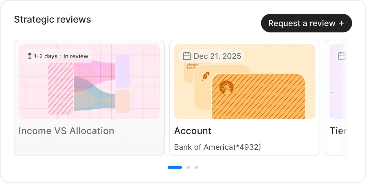
Large (≥528px) and Medium (420–527px) keep the full pill CTA "Request a review" and a horizontal-split empty state. Compact (≤419px) collapses the CTA to an icon-only + button and stacks the empty state vertically.
Card carousel
Review cards stay 260px wide across all breakpoints - what changes is how many are visible (≈2.2 / 1.8 / 1.2). Same gap, same card height, same status badge grammar. Horizontal scroll with three-dot pagination.
Empty state, marketed
The empty state isn't a placeholder - it's the user's first contact with the feature. "Your advisor, on demand" explains what the widget does and ends with the same Request CTA, so empty and populated states feel like the same widget at different points in time.
Status grammar
In review (yellow badge + ETA "1–2 days") and View report (green badge, no ETA). Cards in the same carousel can be in different states simultaneously, so users always see what's pending and what's ready in the same scan.
6
Analysis types
2–3
Sizes per analysis
~30
Chart layouts shipped
1 Eng · 1 PM · 1 Designer
Team
Results
The widget shipped as the entry point to a feature that, in the wealthtech category, is usually a calendar-and-PDF flow. By keeping advisor output inside the dashboard's existing grammar - chart cards, status badges, tap-to-open - users never have to context-switch between "I'm using my product" and "I'm talking to my advisor." The wait time didn't change. The wait experience did.
Reflection
Hybrid models look obvious in retrospect. They aren't.
The dashboard's grammar paid for itself
The chart cards, the status badges, the modal pattern - most of these weren't new. Strategic Reviews is mostly existing components in a new arrangement. That repetition is why six different visualizations don't feel like six different products.
Six charts, many sizes - the system held
Each analysis got its own custom chart, but every one was constrained by the same density rule and the same widget shell. The constraints became the case for shipping six analyses instead of three.
Some calls still feel under-tested
The modal-vs-in-widget decision was the right one for cramped screens. On a 1440px desktop, it's less obvious that the modal earned its keep - that's a measurement we still owe ourselves.
The bet was that you could ship advisory inside a dashboard without becoming a meeting-booking app. The proof is in the seams: where would a user notice they've crossed from "self-serve product" into "advisor space"? After six analyses, dozens of layouts, and one modal, the answer is mostly nowhere.
Role
Product Designer
Timeline
6 Weeks
Platform
Web, Tablet, Mobile
Team
Deliverables
Next Project