Upload. Done.
Designing manual account creation that doesn't feel manual - a PDF upload flow that extracts real holdings, history, and balances without a form in sight.
TL;DR
Most financial apps treat manual account creation as a punishment for when automatic connection fails. We made it a first-class path - upload a bank statement, get a fully populated account with holdings, history, and balance. No form. No column mapping. Two entry points, one flow, and a clear upgrade path to automatic sync.
The problem
Most financial apps connect to your bank automatically - you log in once and your accounts, balances, and transactions appear. But that automatic connection fails more often than you'd think. And even when it works, some users aren't ready to hand over their bank credentials to a third-party app on day one.
When the automatic connection fails, most apps hit a wall. The fallback is a form. Enter your account name. Enter your balance. Done. Except it's not done - now you have a number floating in a dashboard with no history, no holdings, no context. A ghost account.
We wanted to do better than that.
Entry points
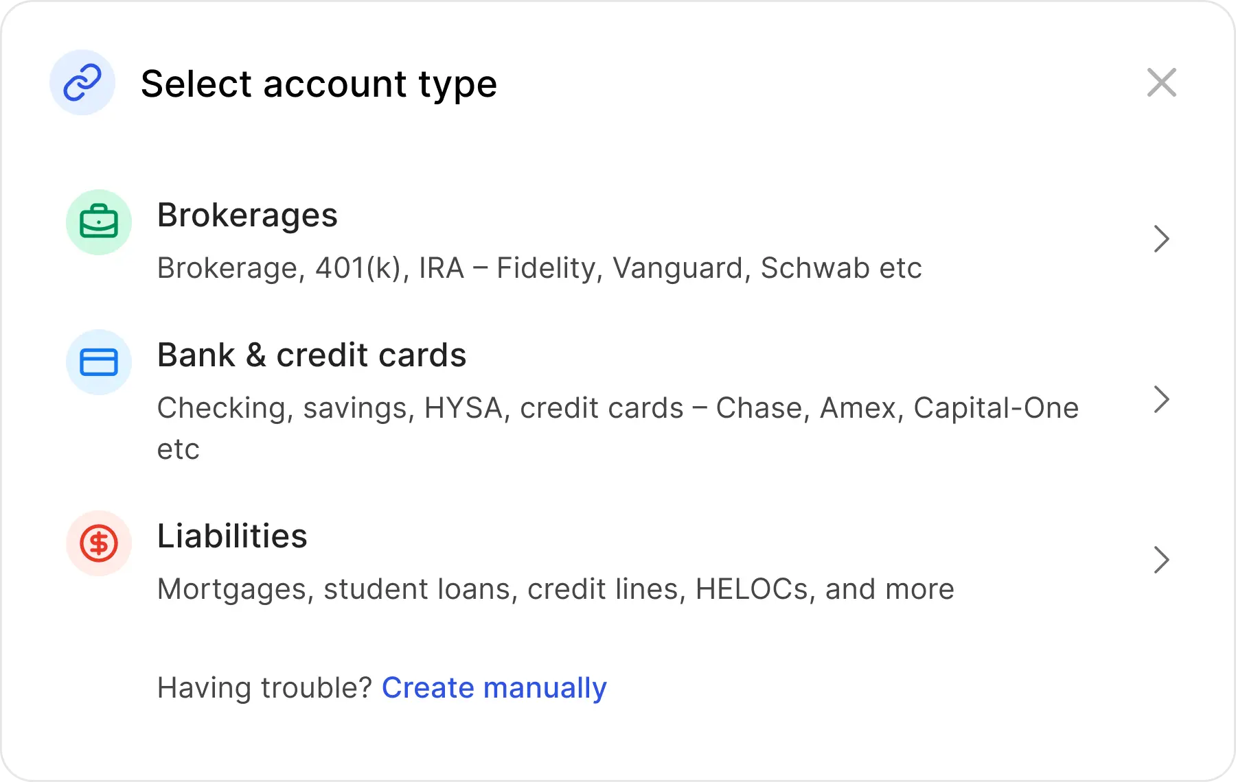
Entry point A - Add Account
From Add Account, the account type selector always ends with "Having trouble? Create manually." The path is visible before anything goes wrong - an intentional choice, not a last resort.
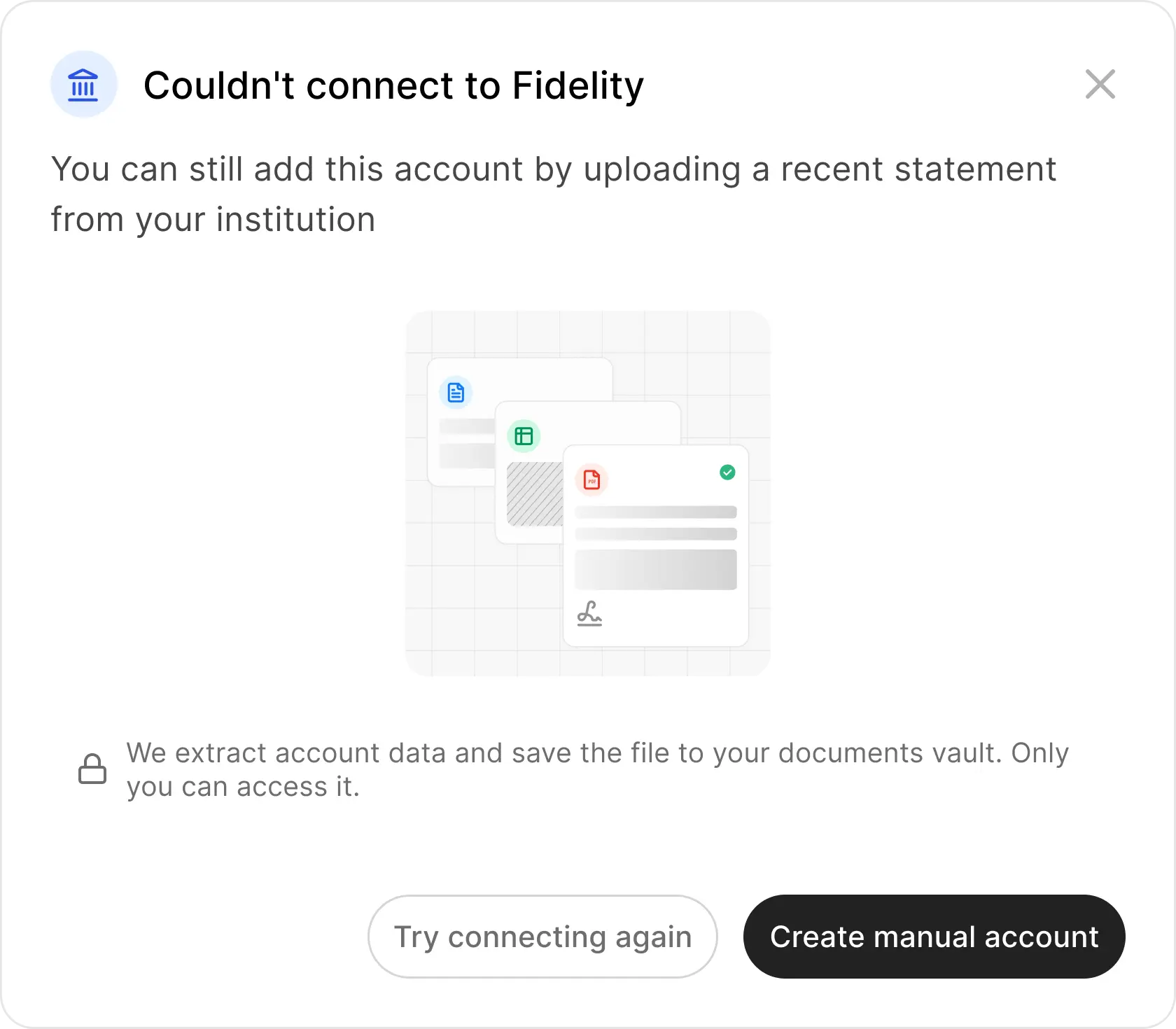
Entry point B - Connection failure
When automatic connection fails, the error screen doesn't dead-end. It pivots: "You can still add this account by uploading a recent statement." Trust copy and a single CTA - no hunting for a workaround.
Research
We audited six competitors: Kubera, Portfolio Performance, Sharesight, Betterment, Monarch Money, and Empower. The pattern was consistent - manual account creation was either hidden, bolted on after failure, or stripped of the features that auto-connected accounts get.
Kubera
Only app with stale data nudges. AI extraction but no visual badge distinguishing manual vs synced.
Portfolio Performance
90+ bank-specific parsers. 3-step wizard preview. Desktop-only.
Sharesight
Best preview step - inline row editing. CSV-only, no PDF.
Betterment
Yellow warning banner after failure. "Connect Manually Instead" - most explicit fallback, but framed as failure.
Monarch Money
Tiered fallback after connection fails. Good discovery, too many steps.
Empower
Anti-pattern: users must type "MANUAL" as a search keyword to find manual creation. Hidden by design.
Moodboard
User journeys
Manual is undiscoverable
Most platforms hide the option until something breaks. Empower requires knowing a secret keyword. Users who need it most can't find it.
Surface upload prominently at the failure point and as an intentional path in Add Account - a confident alternative, not a hidden fallback.
Data goes stale silently
Manual accounts go stale with no warning. Net worth dashboards become inaccurate over time. Only Kubera sends proactive reminders - everyone else ignores the problem.
A stale data nudge on the account card with a direct route to upload a newer statement.
Manual accounts are second-class
Fewer features across every competitor: no transaction tracking, no performance analysis, no historical data. Users who can't auto-connect get a degraded product.
Document Lens extracts holdings, transactions, and balances from the statement - same data richness as a connected account.
The decisions
Two entry points, one flow. Users arrive either from a failed automatic connection or intentionally through Add Account. Each carries different emotional context - frustration vs intent. The flow underneath is identical.
The flow
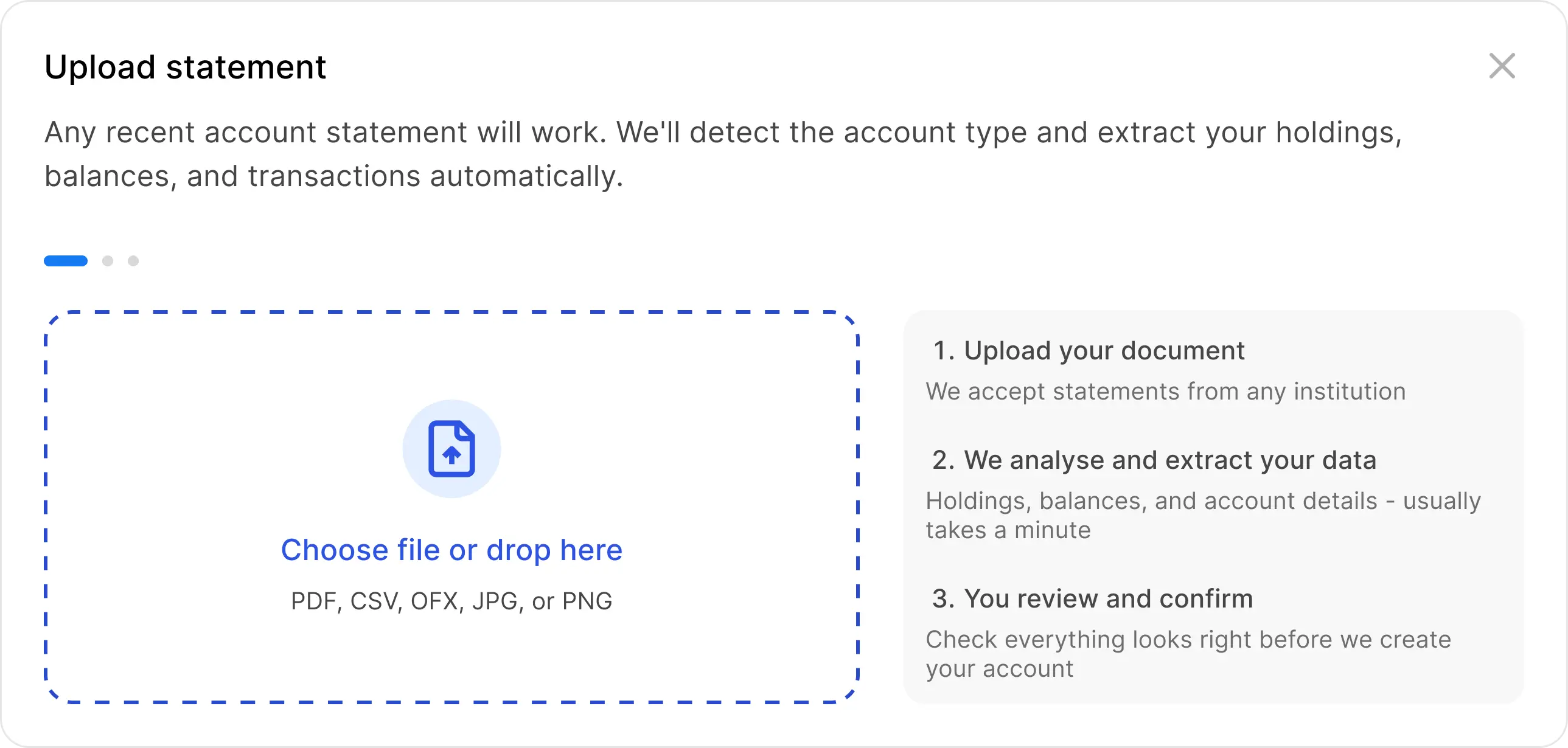
Upload a PDF statement from your bank or brokerage. The modal minimizes. Parsing runs in the background. A persistent toast tracks the state. No form, no column mapping, no reformatting.
Upload
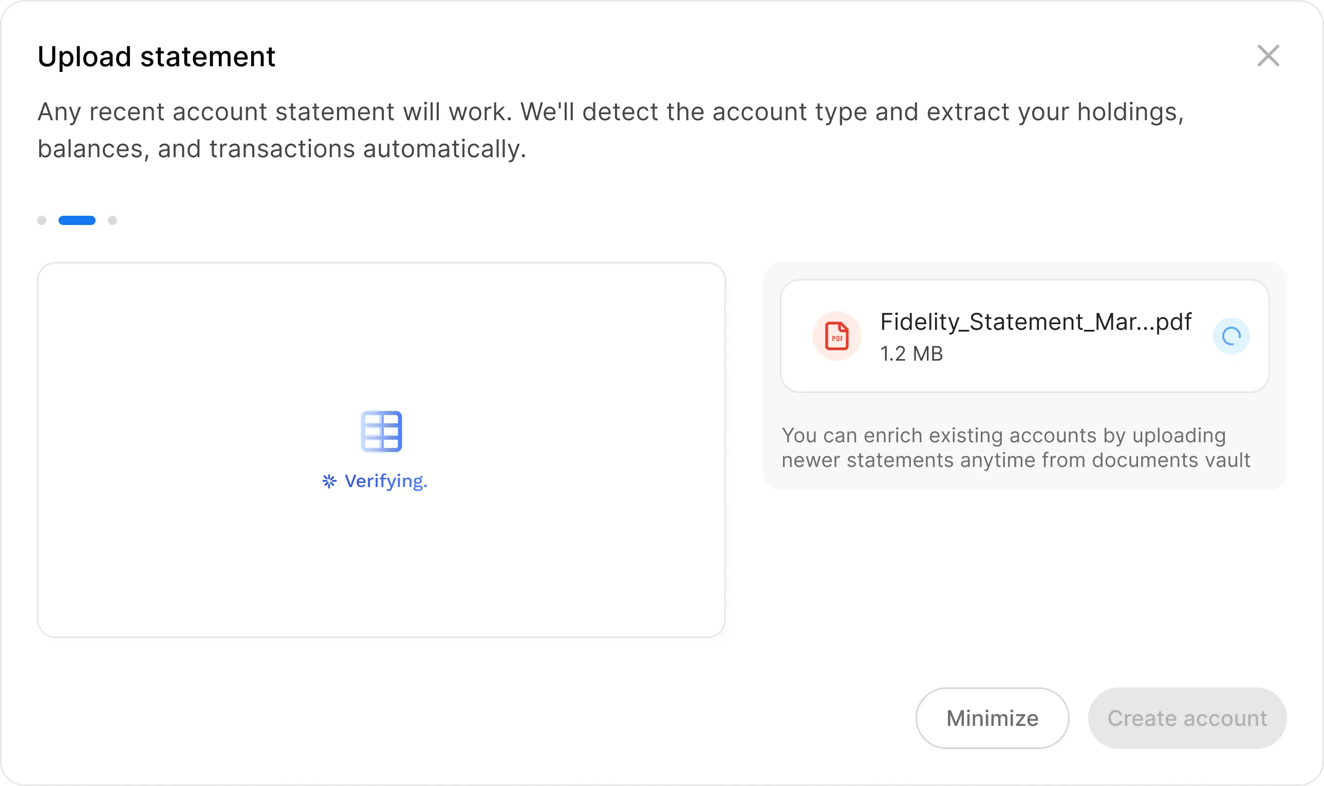
User selects a PDF. The modal shows the filename with an importing spinner and copy that lets them know they can walk away: "We're extracting your account details and transactions. Feel free to continue."
Verifying
Document is parsed in the background. The modal minimizes to a bottom-right toast. A blue dot on the account tab in the header signals something is in progress without interrupting the current page.
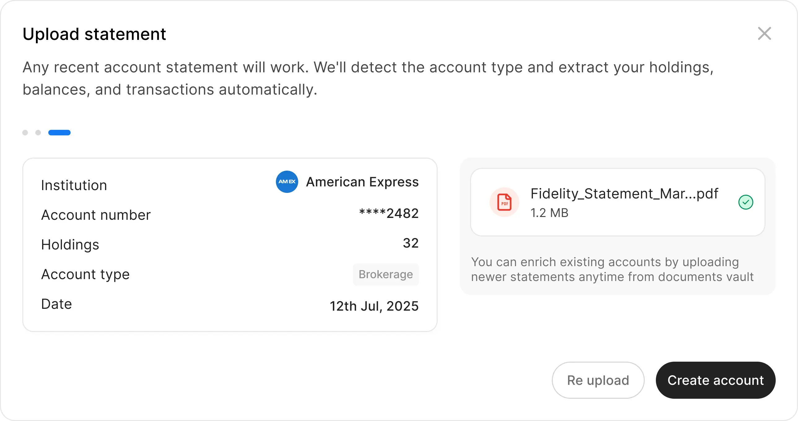
Ready
Parsing complete. The extracted institution, account number, holdings, type, and date appear - no form to fill. One button: Create account.
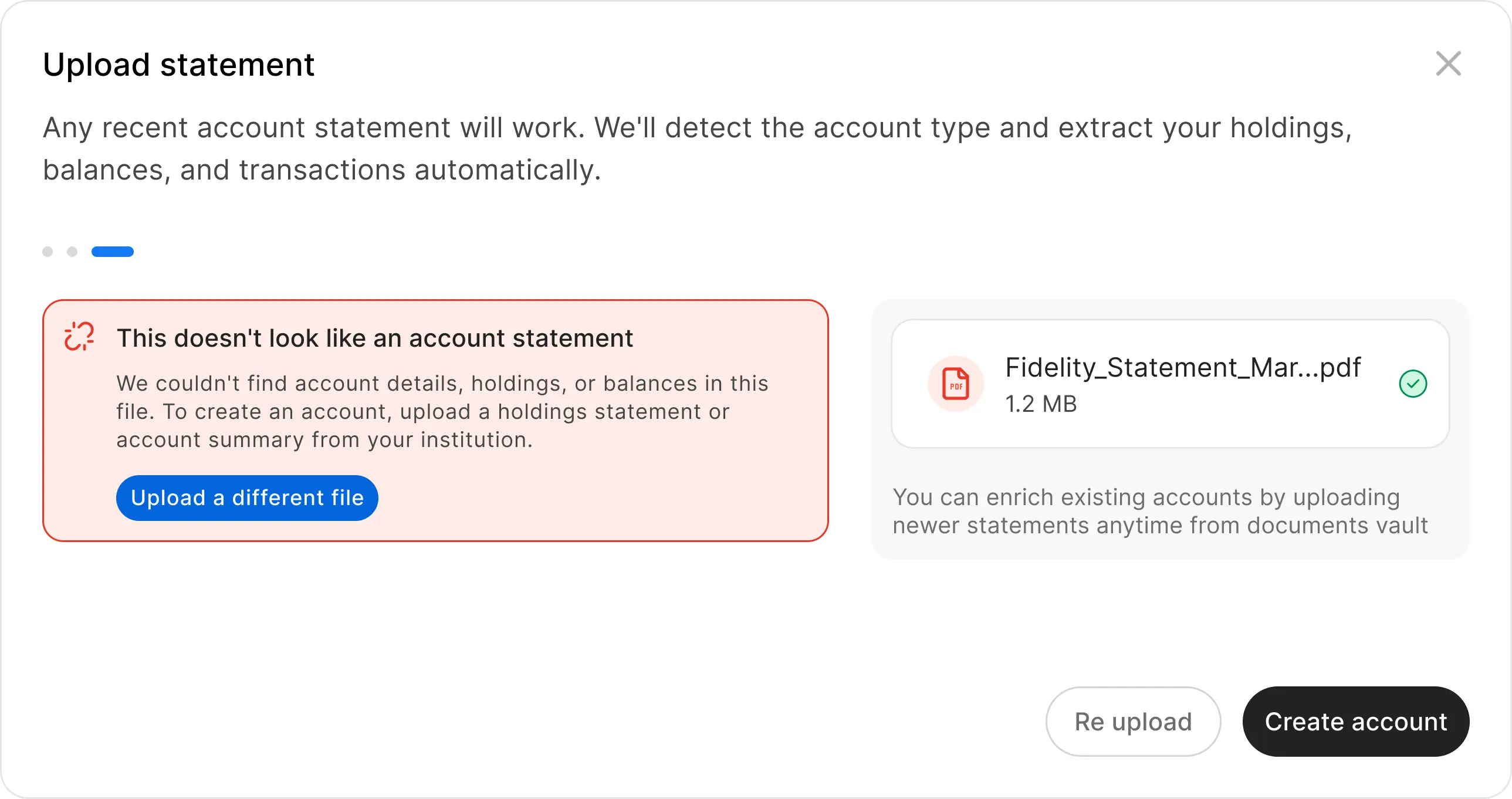
Error
If the file isn't a valid statement, a clear inline message explains why and offers one action: upload a different file. No dead ends.
After the account exists
Most competitors stop at account created. We didn't.
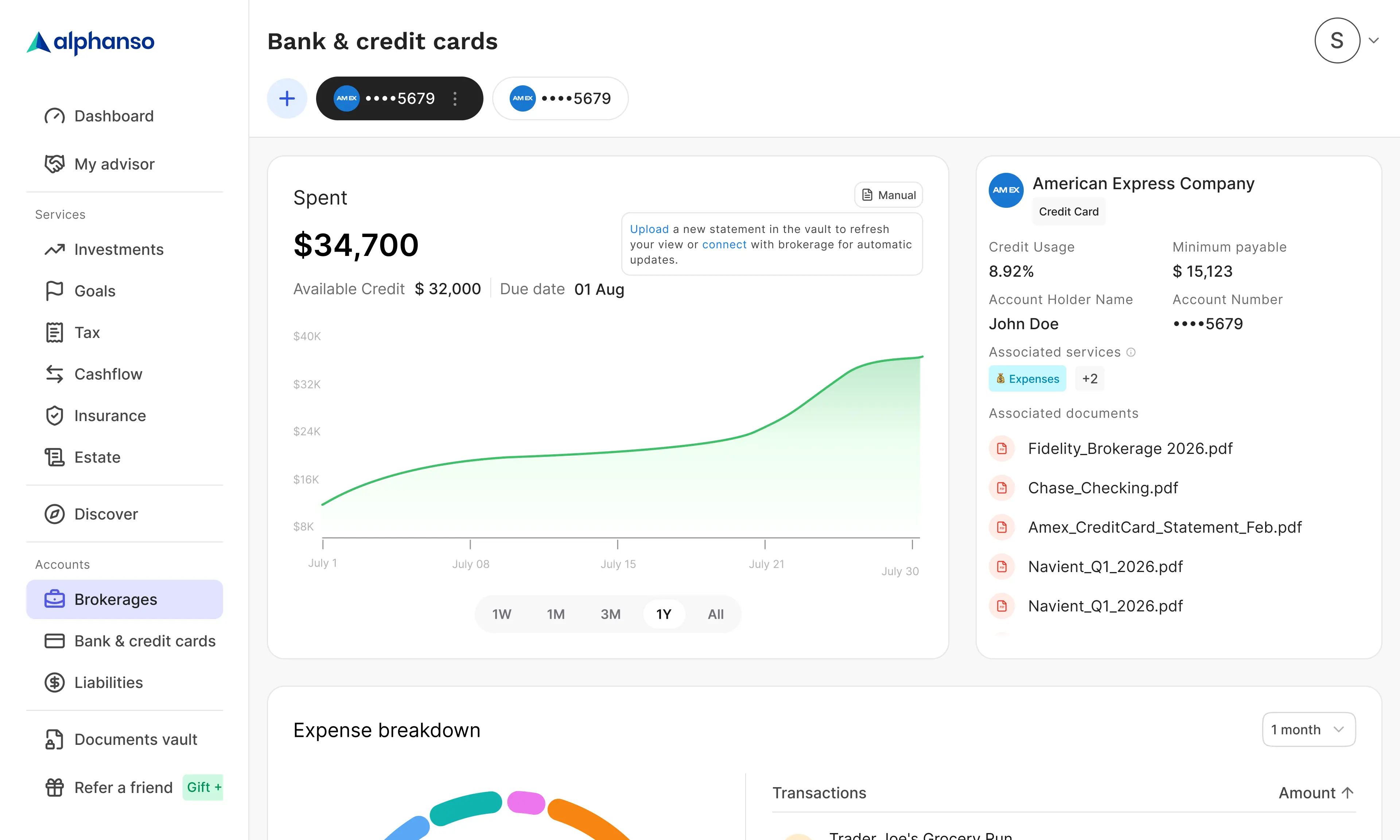
Manual badge
Every manually created account carries a dashed border - honest, not shameful. Synced accounts use a solid border. At a glance you know which data is live and which came from a document. Tap the badge and you're back in the upload flow to enrich the account with a newer statement.
Document history
Every PDF that has ever contributed to the account is listed on the account detail page. Full audit trail, always visible to the user.
Enrichment over time
Upload a newer statement from the badge on the account detail page - the account updates in place. Same flow as creation, reused for enrichment. The feature doesn't end at first upload.
Stale data nudge
"Upload a new statement to refresh your view - or connect your brokerage for automatic updates." The upgrade path to automatic sync is always one tap away. Manual is a starting point, not a dead end.
2
Entry points
98%
Parse accuracy
3
Directions killed
3 weeks
Design to ship
1 Eng · 1 PM · 1 Designer
Team
Results
The flow ships as the fallback path for users whose automatic connection failed - and as an intentional first step for users who aren't ready to connect yet. By treating the PDF as a data-rich source rather than a workaround, manual accounts get the same holdings, history, and balance data as connected ones. The badge, the document list, and the stale nudge close the loop: manual isn't lesser, it's a starting point.
Reflection
Three things worth keeping from this project.
Research killed two features before they shipped
Password-protected PDF support was designed before we checked whether US banks actually use passwords. They don't. Research is cheaper than building the wrong thing.
Confidence is a design decision
Skipping the correction UI was the highest-stakes call. A 98% accuracy rate earns the right to show output as fact, not a draft. Showing editable fields would have told users to distrust the system before they'd tried it.
The upgrade path matters as much as the flow
Designing manual creation without designing the route out of it would have left users stranded. The stale nudge and the badge aren't polish - they're the argument that manual accounts are first-class.
The bet was that uploading a PDF could create an account as rich as one that's been connected for months. The parse pipeline makes that true. The design's job was to not get in the way of that - and to make sure users knew where to go next.
Role
Product Designer
Timeline
5 Weeks
Platform
Web, Mobile
Team
Deliverables
Next Project