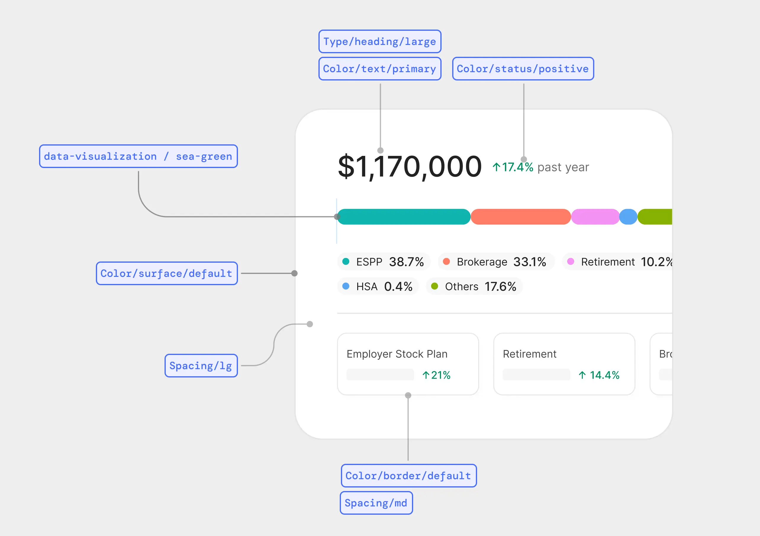
Portfolio Allocation
Donut for asset-class breakdown.
A design system for Alphanso, a wealthtech platform serving people tracking $250k+ portfolios. Built to deliver the calm and restraint a money product demands.
TL;DR
Built a design system for users tracking $250k+ portfolios - restraint, color with one job, clarity over cleverness - across 14 component families, a wealth-management vocabulary, and a 13-chart data viz library. Mockup time dropped from 1–2 days to half a day.
The fracture
People moving real money read consistency as competence. A misaligned number, a button that behaves one way on this screen and another way on the next - each one is a small reason to wonder if the rest of the product is held together with tape.
For a SaaS tool, inconsistency is a quality issue. For a product where users are tracking portfolios of $250,000 or more, it's a trust issue.
The product had grown to a point where this needed to be deliberate. So I stopped shipping screens, blocked time, and built the system.
Research
In fintech, what's familiar feels safe. If a transfer flow doesn't work like the user's bank, they get nervous before they trust it. So instead of inventing, I studied - five competitors covering planning, investing, and full-service wealth management.
Wealthsimple
Theme-based investment buckets
Origin
Planning-led approach
Facet
Onboarding flow + pricing transparency
Range
Planning approach + flat-fee positioning
Titan
Niche, tech-focused audience
The stance
The product made the call: boring is safe. People moving real money want familiar, calm, and clear - they don't want to be impressed by gradients, they want to find their numbers and trust them. My job was to commit to that and go deep, not to argue it. That requirement turned into three rules - every component decision had to follow at least one.
Foundations
The token system stays small on purpose.
Color
Eleven-step grayscale. Borderline Blue as the only brand accent. Semantic red for losses, green for gains. A defined data-viz palette beyond that. Chromatic colors carry category meaning - never decoration.
Brand & semantic
Grayscale
Data viz
Spacing
XXS to XXXL on an 8pt grid, with 4 / 12 micro-steps where 8 felt off. Each size has a documented usage note.
Radius
Three values. No pill buttons, no sharp corners.
Type
Work Sans for headings, Inter for body and detail. Two families, four weights, a shared size scale. Numbers use tabular figures so columns line up.
Heading / Serif / Light / xxxl-light → Body / Regular / m-regular
Shadow
One subtle drop shadow. Used sparingly - only when elevation carries meaning.
Token architecture
Tokens are named hierarchically - broadest category first, then subgroup, then state or scale. Same pattern across color, spacing, type, motion. Reading a token name tells you where it lives and what it does.
The system
Fourteen component families, every one built against the three rules - here's the catalog.
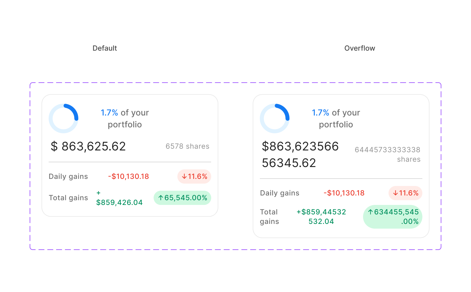
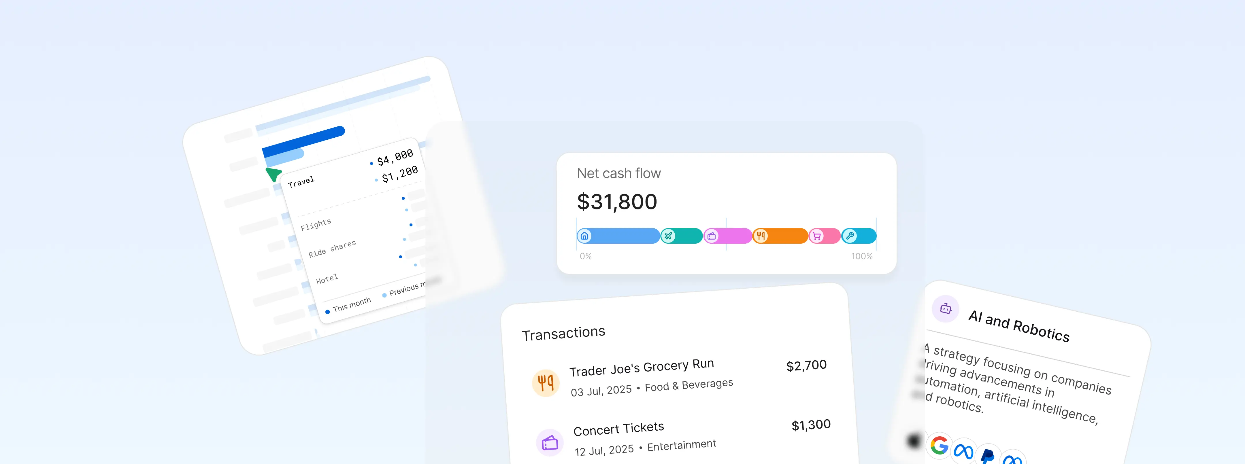
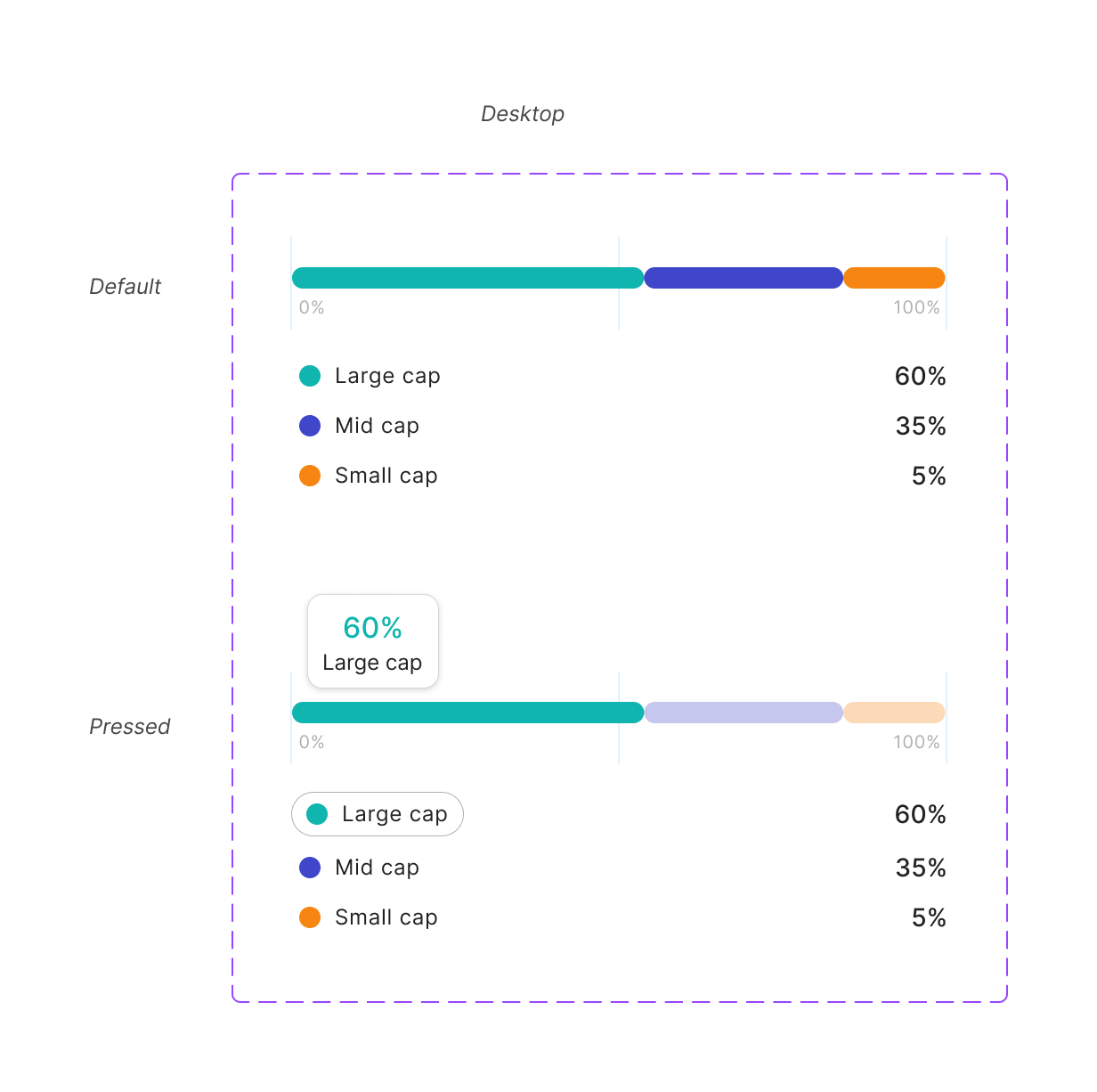
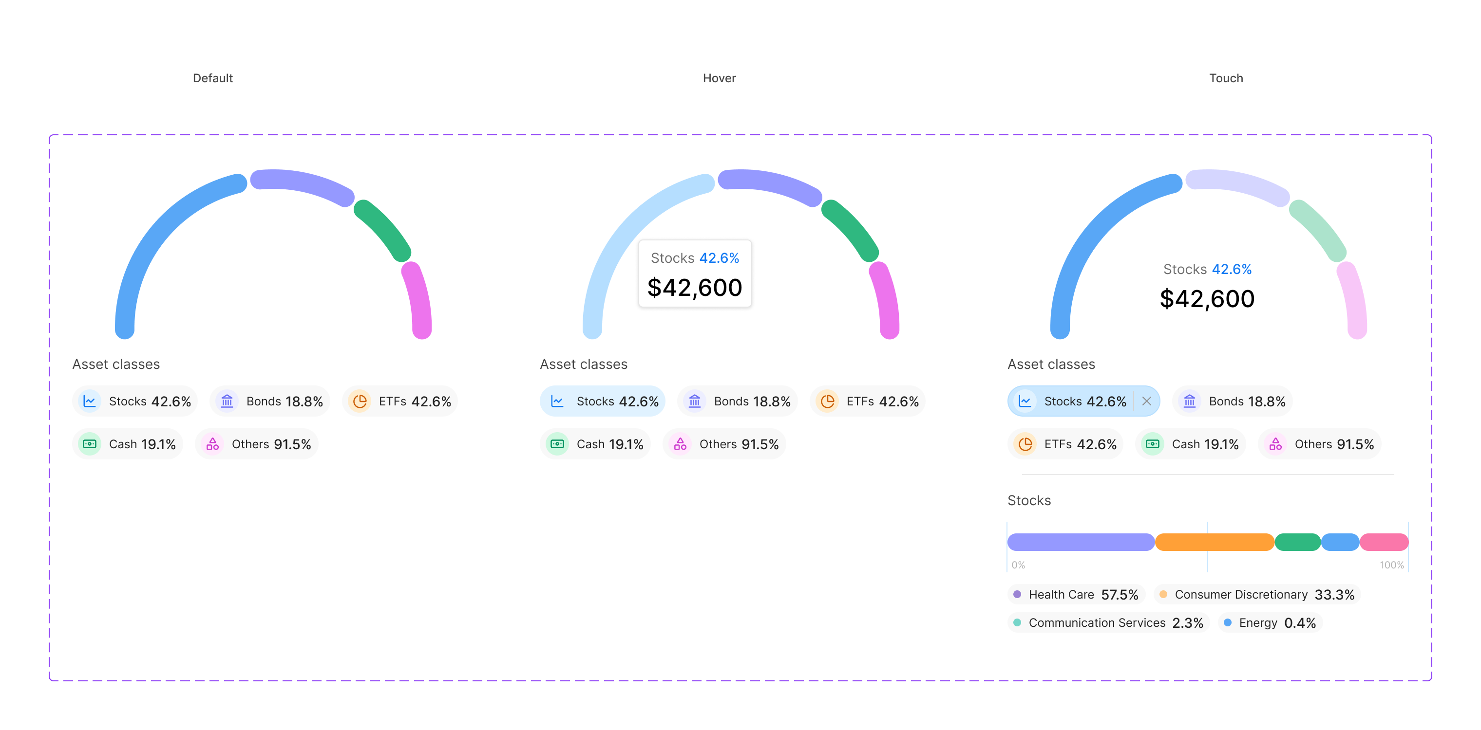
Restraint as the feature. Thirteen chart types, six color tokens, no decoration. One definition resizes from a 200px sparkline to a full-screen detail view.
Portfolio Allocation
Donut for asset-class breakdown.
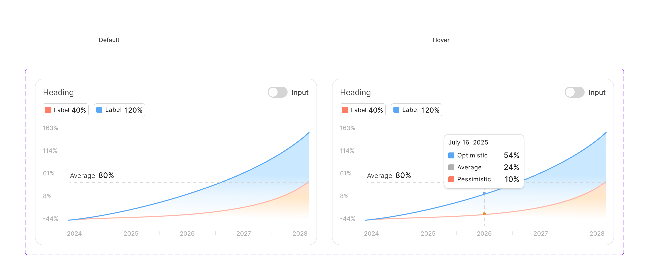
Line Chart
Time-series with positive / negative variants.
Stacked Bar
Multi-series comparison over time.
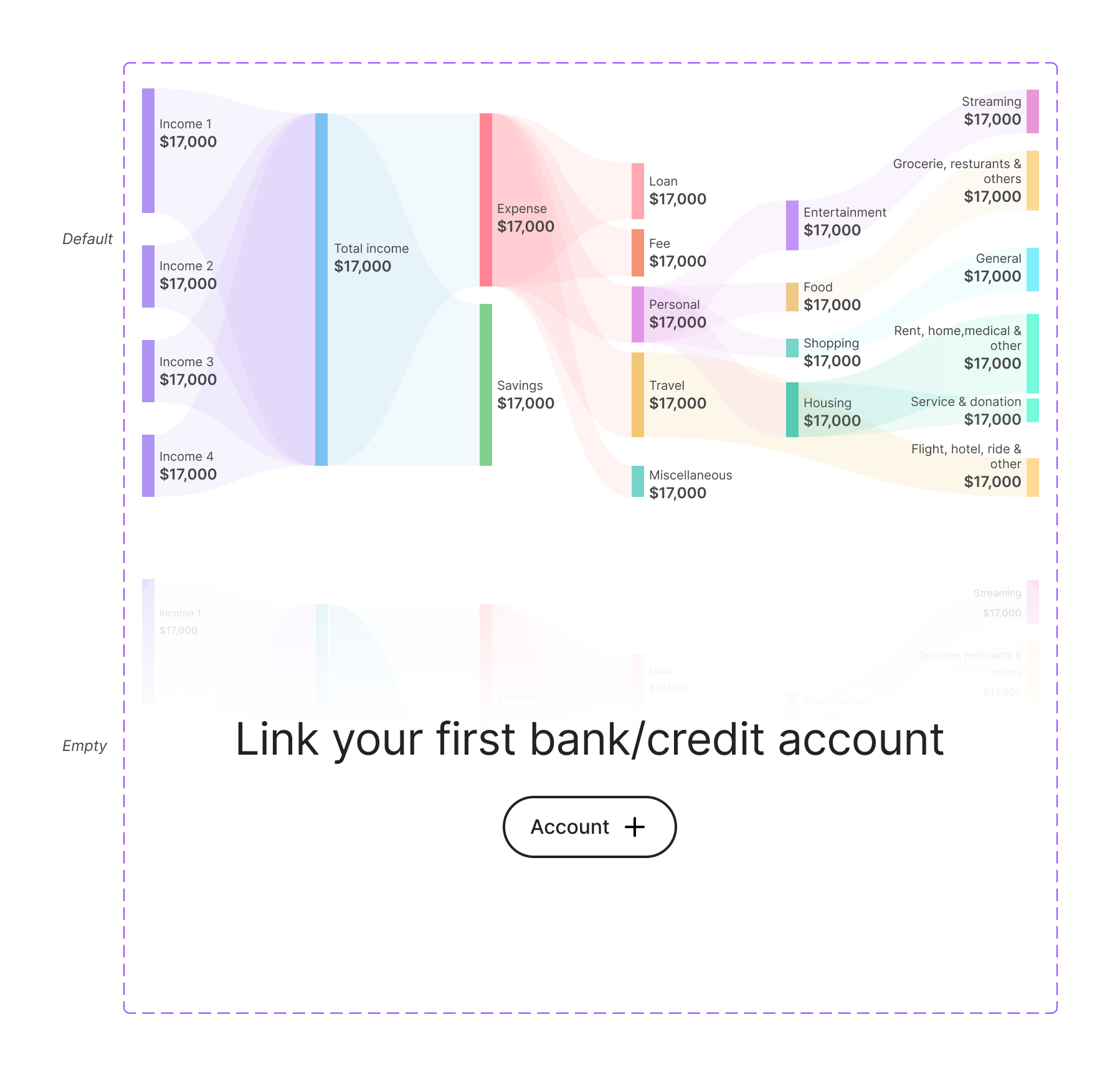
Sankey
Income vs expense flow.
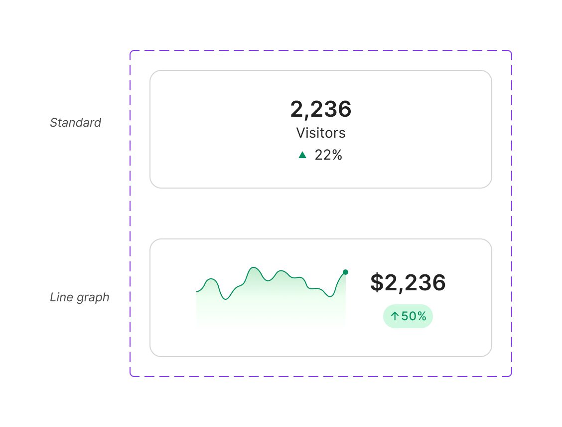
Big Number
KPI tile with sparkline or delta.
Donut Chart
Categorical breakdown.
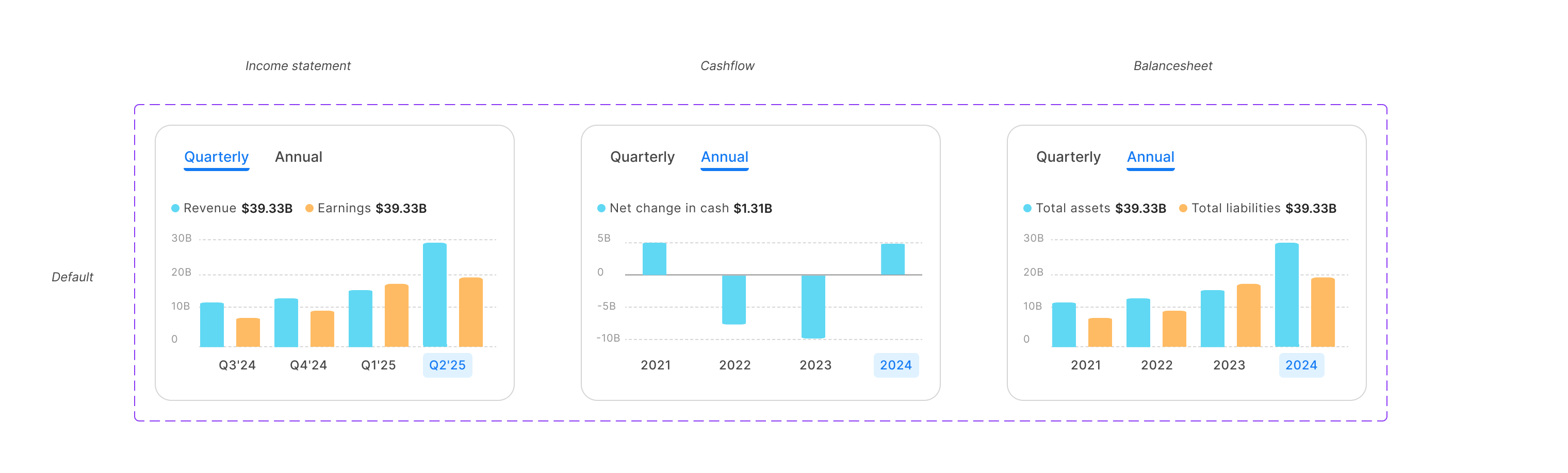
Donut - variant
Alternate donut treatment for sub-views.
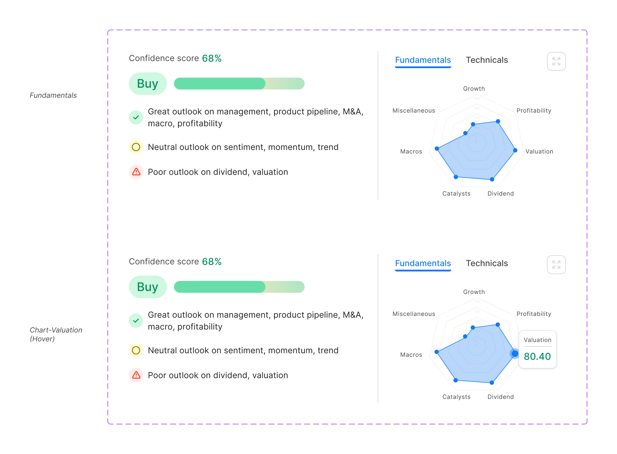
Fundamentals Radar
Multi-dimensional company snapshot.
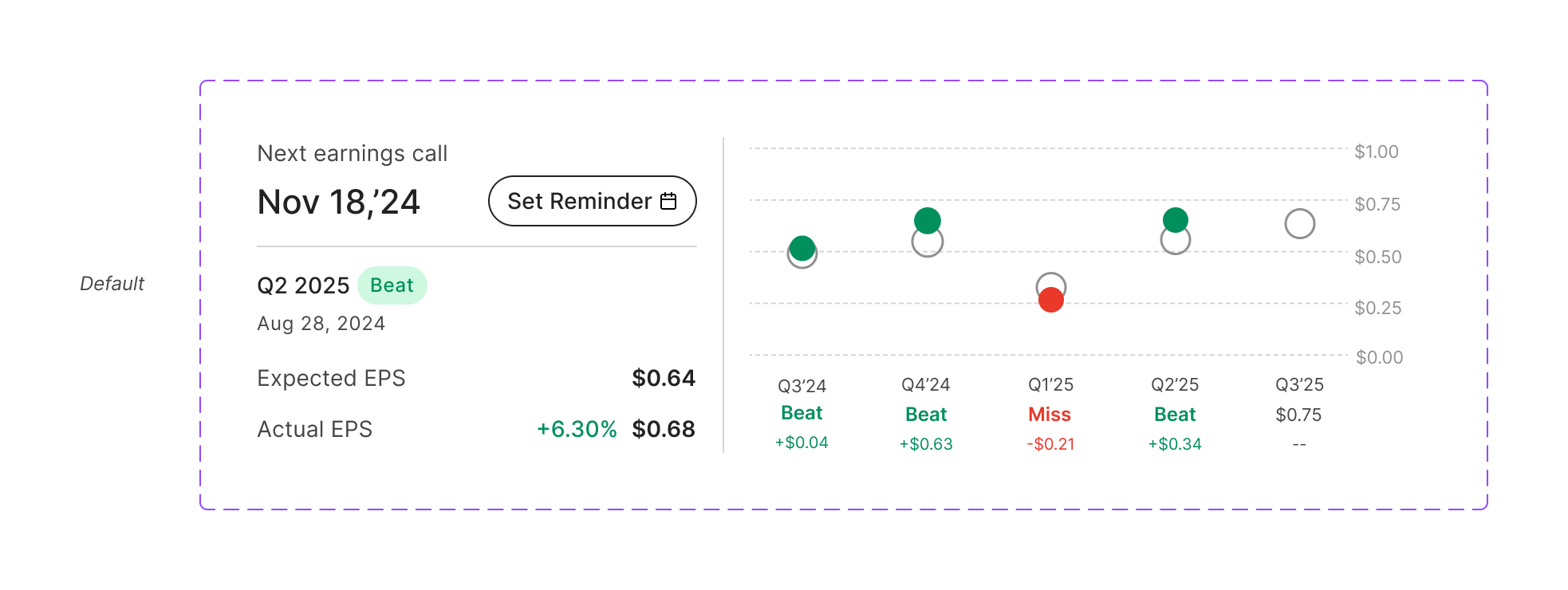
EPS Performance
Earnings-per-share trend with reminders.
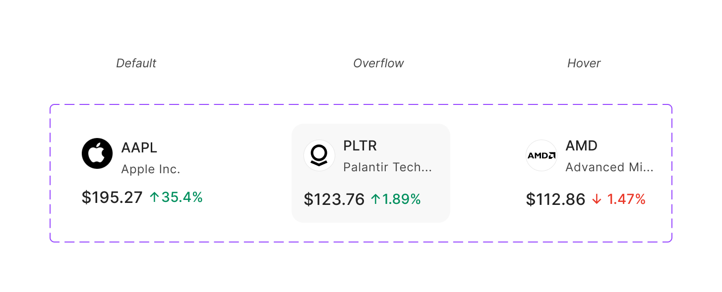
Price Ticker
Real-time price change card.
Building alongside agents
A system maintained by one person stays consistent only if it can review itself. As the surface area grew, I built a layer of agents on top of the DS - each one a Claude Code skill that operates on the Figma file directly:
ads-builder
Composes new screens from existing components - drop a brief, get a layout assembled with the right tokens and slots.
ads-linter
Audits Figma components against the system: token bindings, theme compliance, layer naming, missing states. Generates structured component descriptions.
ads-migrator
Ports old components to the new agent-optimized library following a 5-step workflow - read, analyze, propose, build, verify.
ux-copy
Writes button labels, errors, tooltips, microcopy that match the platform voice - reads text layers from Figma directly when needed.
grid-resize
Applies the responsive grid across breakpoints. Encodes the full spec - five breakpoints, column counts, panel splits, widget sizing.
The trick wasn't the agents themselves. It was writing structured component descriptions once so they could read the file the way I do. I still make the design calls; the agents handle what used to eat my afternoon.
1–2d → ½d
Mockup time
14
Component families
13
Chart variants
1 Eng · 1 PM · 1 Designer
Team
Results
The most concrete outcome was speed. Screen mockups that used to take 1–2 days started landing in half a day. Design review turned from "is this consistent with what we shipped before?" into "is this the right pattern for this problem?" - a much better conversation. Scope-wise, the system covers fourteen component families, thirteen-plus chart variants, an atomic table system, and a wealth-management vocabulary that no off-the-shelf system would have given me.
Reflection
Building alone is fast, but it's lossy.
Decisions never get pressure-tested
The labels vocabulary, for instance - I decided it. Nobody pushed back. The system reflects me, not us, and that debt compounds with every component.
Convention is trust, but it can become same-ness
Five competitors taught me what to keep familiar. None of them taught me where to risk being different.
Agents make solo less lonely, not less subjective
ads-linter can flag a token violation. It can't tell me when 'familiar' has become 'derivative.'
What I learned: in regulated, high-stakes domains, restraint is a feature, not a constraint. The harder lesson was that working alone shapes what you make. The next version of this system needs more than another set of tokens - it needs another point of view.
Role
Product Designer
Timeline
Ongoing
Platform
Web, Tablet, Mobile
Team
Deliverables
Next Project